
 |
|
| 05-15-2009, 10:53 AM | #89 |
|
Major General
  
1299
Rep 7,389
Posts |
Bill ee, did you do anything besides saturation? I really like how the sky pops with the highlighting and rays.
If you like, DxO's Optics Pro 5.3 will automatically correct for that lens disortion of the straight lines near the edges curving. I use DxO for my RAW conversion and automatic correction for geometric lens and body errors and then use PS for more serious adjusting. The DxO allows lots of adjustments to saturation, contrast, dynamic range, straightening horisons, etc., so most of my images don't go into PS. I find that DxO does a much better job than Canon's software and is much easier to use for these type adjustments than PS. Getting rid of lens distortion used to be no big thing to me, until I processed my first batch through DxO and saw the before and after. Now I notice it on the images of others and have become an apostle for DxO. Sorry, I'm not meaning to take away from a nice image.  Dave
__________________
|
|
Appreciate
0
|
| 05-15-2009, 10:58 AM | #90 |
|
Lieutenant General
   
1883
Rep 17,322
Posts |
|
|
Appreciate
0
|
| 05-15-2009, 11:20 AM | #91 | |
|
Major General
  
1299
Rep 7,389
Posts |
Quote:
Dave
__________________
|
|
|
Appreciate
0
|
| 05-15-2009, 11:24 AM | #92 |
|
. . .
192
Rep 2,391
Posts |
unnatural how? it's realistic - that's what happens.
edit: unless, of course, you're shooting telephoto of something up close. then the mountains would be out of focus, but not with motion blur.
__________________
2009 135i | space grey | sport | navi | hifi | heated
dinan stage 2 software | bmw performance exhaust kw v2 | hotchkis front sway | vmr v710  |
|
Appreciate
0
|
| 05-15-2009, 11:39 AM | #93 | |
|
Major General
  
1299
Rep 7,389
Posts |
Quote:
If he's trying to get the look of panning, then everything in the foreground and background should be blurred. It looks to me as if that's the effect he's going for, to bring attention to the car and give the feeling of speed. If that's not what he's attempting, then I think that he needs to take more of the blur out, perhaps. The attention on the accuracy of the mountain will take away the focus on the car. Of course, the objective might be to show the car in a scenic setting. If that's the case, then he needs to bring up detail on the mountain and fog/clouds. There are several "legitimate" ways to go with with this picture. I just assumed from his first changes that he was trying to focus on the car and give more feeling of speed. BTW, the color balance, as adjusted, of the car is spot on, IMHO. Dave
__________________
|
|
|
Appreciate
0
|
| 05-15-2009, 11:54 AM | #94 | |
|
Lieutenant General
   
1883
Rep 17,322
Posts |
Quote:
 im open to any feedback though. after all, this is a learning process and any input is appreciated im open to any feedback though. after all, this is a learning process and any input is appreciated |
|
|
Appreciate
0
|
| 05-15-2009, 12:03 PM | #95 |
|
Major General
  
1299
Rep 7,389
Posts |
Yes, please take all comments in the spirit of learning. I'm still a novice myself at PS (there's so much to learn). I've got a few pictures that I've alterred in several ways and my favorite changes from day-to-day. There's no "one way" that's "right."
Dave
__________________
|
|
Appreciate
0
|
| 05-15-2009, 12:16 PM | #96 |
|
Lieutenant General
   
1883
Rep 17,322
Posts |
|
|
Appreciate
0
|
| 05-15-2009, 12:57 PM | #97 |
|
. . .
192
Rep 2,391
Posts |
right on. i do a lot of compositing at work. mainly video - so trying to emulate accurate depth of field characteristics all of the time causes me to notice things like that. the unrealistic blur (however well done it is, and it is pretty well done there, jh), throws me off.
__________________
2009 135i | space grey | sport | navi | hifi | heated
dinan stage 2 software | bmw performance exhaust kw v2 | hotchkis front sway | vmr v710  |
|
Appreciate
0
|
| 05-15-2009, 09:17 PM | #98 | |
|
Major General
  
721
Rep 5,382
Posts |
Quote:
i really don't remember what i did, i believe i used the burn tool, adjusted the color balance, and contrast a little bit. i re-did the pic though cause you can see a line at the very top from my bad burning skills. these are the 2 new ones i just fixed, i like the 2nd one. it seems to pop out more, but it does look like i fixed it up a bit too much.  
__________________
|
|
|
Appreciate
0
|
| 05-19-2009, 01:16 PM | #99 | |

531
Rep 3,612
Posts |
Quote:
wow, wow and wow!  |
|
|
Appreciate
0
|
| 05-27-2009, 12:36 AM | #101 |
|
Lieutenant Colonel
 
114
Rep 1,813
Posts |
How did you make the orange from the sky come out, or like in the second pic, make the clouds look like that. I love this kinda stuff. Wish i would of saw all of this earlier for my PS class, would of helped out a lot.
__________________
 2006 E90-Running like brand new again. Take that insurance company 95 S14-Sold 95 S14 Rb25det-Vrom Shhh |
|
Appreciate
0
|
| 05-28-2009, 04:24 PM | #102 |
|
Brigadier General
 
250
Rep 3,524
Posts |
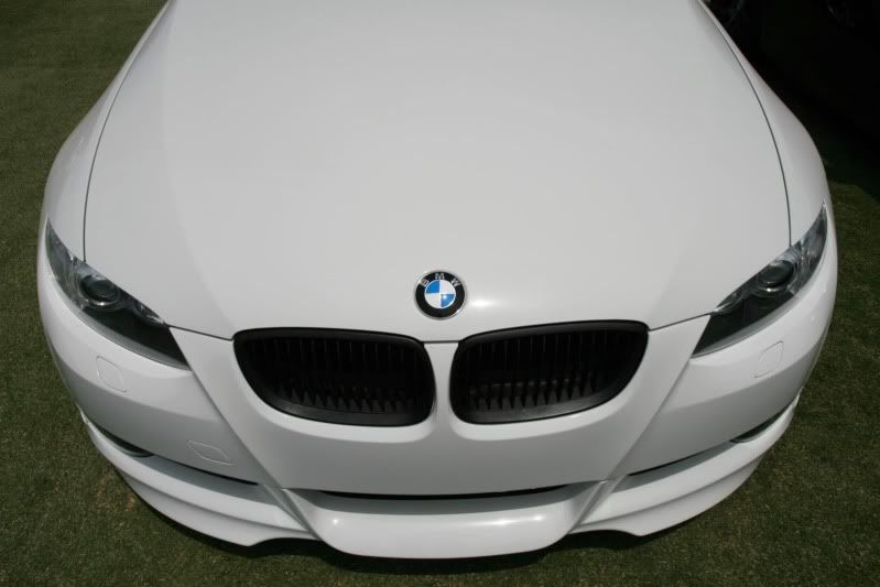 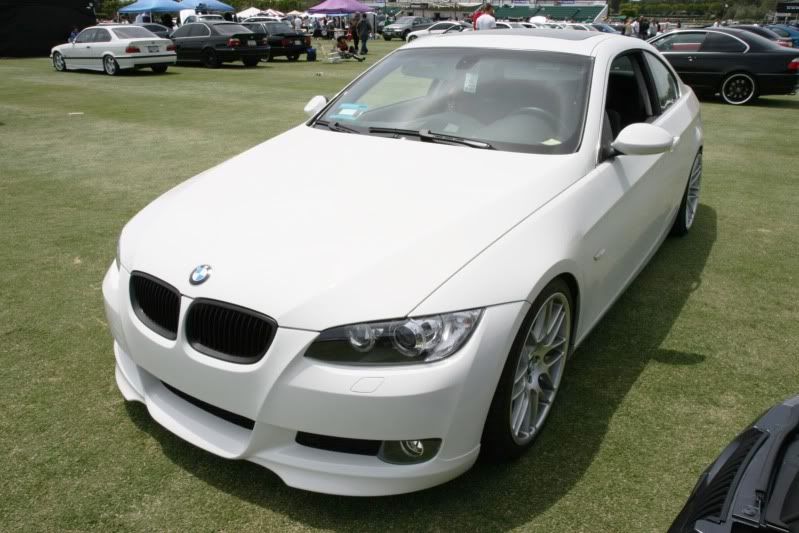 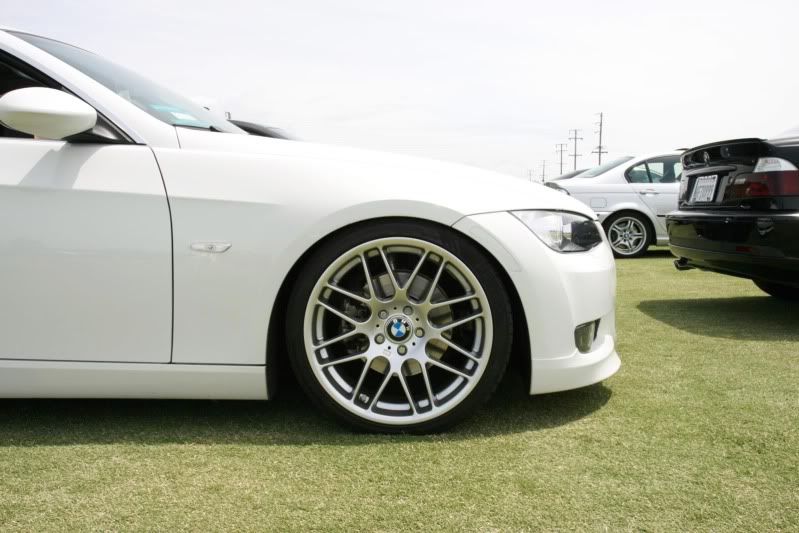 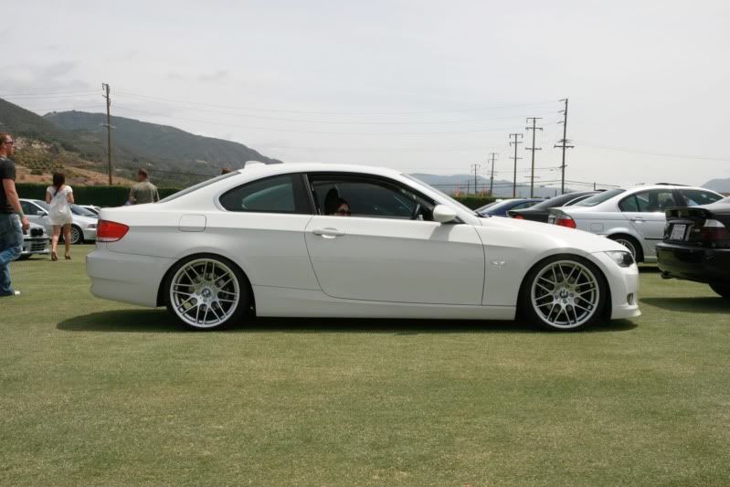 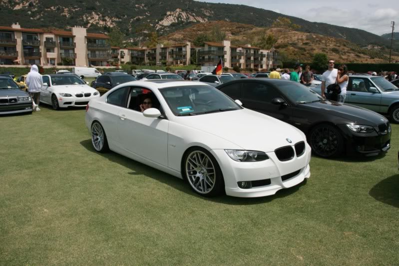 is it possible to edit these? |
|
Appreciate
0
|
| 05-28-2009, 04:32 PM | #103 |
|
Major General
  
1299
Rep 7,389
Posts |
Is the Pope Catholic???
What do you want to do and what software do you have? Dave
__________________
|
|
Appreciate
0
|
| 05-29-2009, 10:13 AM | #106 |
|
Major General
  
1299
Rep 7,389
Posts |
Yeah, I see that bright highlight. With orange cars you really need to be careful with color balance. I think the "Before" was too warm, but I think your adjusted balance is a bit too green. You probably needed to mask the car and get its color balance where you wanted it (I like where you have it) and do a separate balance on the background. You might consider taking the background to sepia or B&W and keep the car orange. It would really pop then.
Speaking of background, realize that I'm old fashioned and behind the times, the angle doesn't bother me too much, but that building in the background annoys me. You could Clone out that building, if you agree. I'd try to bring up the details in the wheels a little, if the pixels are there. About the angle on the horizon, I like angles, but when the horizon gets close to horizontal, but not all the way, then you risk people thinking that you simply didn't pay attention to the horizon. Personally, I'd straighten the horizon OR increase the angle. Still, I see all you guys doing lots and lots of angles, so I'm open to your interpretations and discussion of when and why to use angles. The crop is so close to the rear of the car, you may not have many options with the angle now. Dave
__________________
|
|
Appreciate
0
|
| 05-29-2009, 04:41 PM | #107 | |
|
Lieutenant General
   
1883
Rep 17,322
Posts |
Quote:
its also funny that you mention the lack of detail in the wheel. i posted this before and after on my 'wall photo's on facebook where i mentioned 'i dont like how dark the wheels are' thanks for the input though, its the whole reason i post these edits  |
|
|
Appreciate
0
|
| 05-29-2009, 04:53 PM | #108 | |
|
Major General
  
1299
Rep 7,389
Posts |
Quote:
Yeah, LOL, we all have our ideas about how things should look. I backtrack all the time in PS, thinking somethings a good idea until I see it and go back to where I started. Give and take is what this forum is all about. Dave
__________________
|
|
|
Appreciate
0
|
| 06-02-2009, 01:25 AM | #109 |
|
Brigadier General
 
250
Rep 3,524
Posts |
iono make them look brighter and more crisp? I have photoshop but i suck with it
|
|
Appreciate
0
|
| 06-02-2009, 04:54 AM | #110 |
|
Captain
    86
Rep 619
Posts |
in lightroom i added a GND (graduated neutral density) filter to the sky. basically turned the birhgtness or exposure down in the area the filter was in with out hitting the foreground of the pic.
__________________
|
|
Appreciate
0
|
Post Reply |
| Bookmarks |
|
|